← Kateryna Derevianko
Contact
01 / AI VOICE JOURNALING · iOS · IN TESTFLIGHT BETA
A journaling app that remembers what you forget.
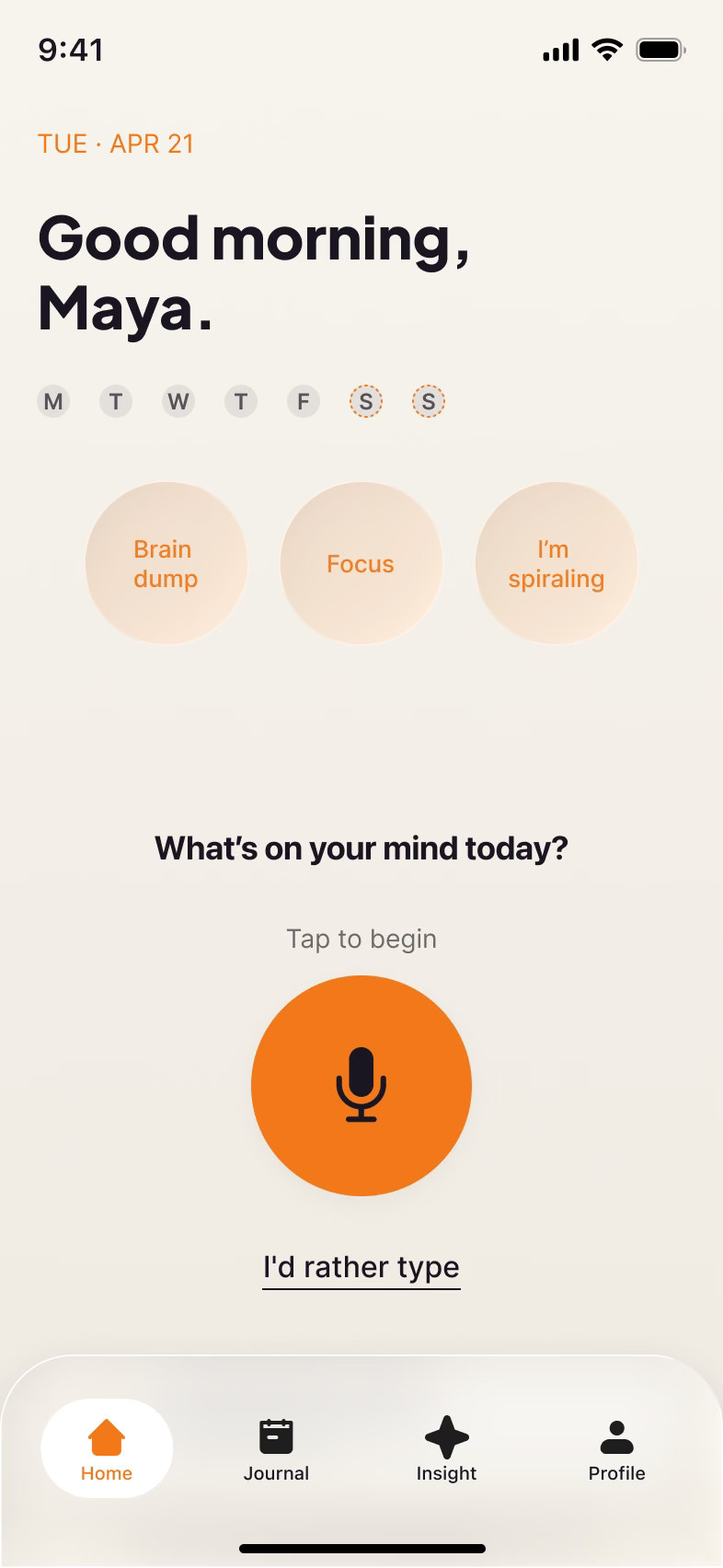
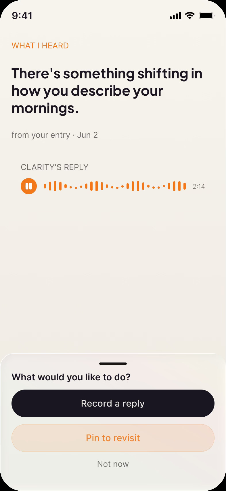
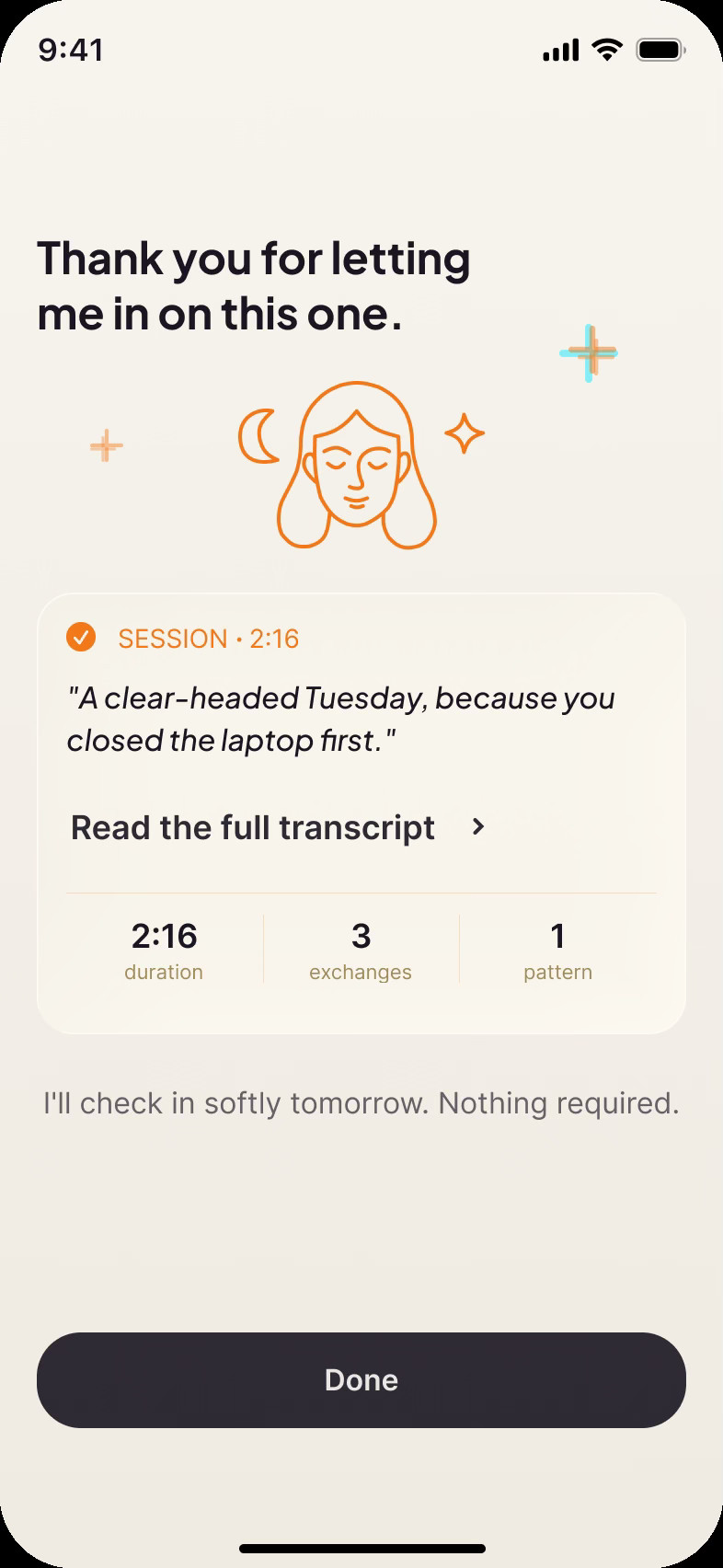
Clarity is voice-first. You talk, it listens, and over a few weeks it
shows you patterns you would never catch from inside your own week.
THE PROBLEM
People can't see their own patterns from inside their own week. Journaling apps hand them a blank page and a streak to keep.
MY ROLE
Product design end to end. I ran strategy, positioning, UX, UI, the design system, the wired prototype and monetization. Clarity is a founder-owned product and I led its design.
STATE
iOS · TestFlight beta · 60+ screens · 11 flows · 300+ prototype wires
02 / RESEARCH
Before any UI, I used AI to map the problem space: how these struggles show up, why journaling and habit apps tend to fail the people who need them most, and which pains to design for first. It pulled together what’s publicly documented about ADHD, attention, and follow-through into a ranked pain map that every screen answers to.
The blank page kills journaling
Most journaling habits die within the first week, and the blank page is where they die: no cue, no structure, no momentum. Voice input plus a single opening question removes that moment entirely.
Shame is the real churn
People rarely leave because an app is bad. They leave because missing two days feels like proof they’re broken, and streaks turn absence into guilt. Absence had to become safe.
Presence lowers the cost of starting
People start hard things more easily when something is with them: company, not instructions. That shaped the mic-first sessions, the focus mode, and the tone of every reply.
DECISION / Design for the struggle, not the label
The research drew heavily on communities where these struggles are clinical and diagnosed. The product deliberately never uses those labels. Anyone who struggles should feel welcome, never categorized, and never diagnosed by an app.
A NOTE ON RIGOR
This desk research was AI-assisted synthesis of public sources. We treat it as directional input for design decisions, not verified evidence, and this case study doesn’t cite it as such. We’re our own first users, and we test as we build.
03 / STRATEGY RESET
“A diary that talks back” wouldn’t survive the week.
Halfway through, I ran the concept through a hard stress-test, arguing it from five angles: psychologist, product strategist, designer, growth, and the user I’m building for. The verdict was uncomfortable: beautiful, calm, thoughtful, and deletable within a week. Voice journaling on its own gives people nothing to come back for.
“I’d download it immediately. I’d use it for four days. Then I’d feel guilty. Then I’d delete it.”
USER SEAT · STRATEGY STRESS-TEST
01 · Memory became the product
The reframe: an AI that remembers what you forget about yourself, with voice journaling as its input. That became the positioning, an app that explains you to you.
02 · Reflection must lead somewhere
Understanding alone evaporates. Every insight now carries a next step: a pattern card, a protected morning, one focus session. The loop closes in the real day, where it actually counts.
03 · Absence became safe
No streaks anywhere in the product. Coming back after days away greets you with “you’re back,” turning the moment that kills most habit apps into a re-engagement hook.
04 / CORE DIFFERENTIATOR
Memory is the product.
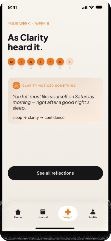
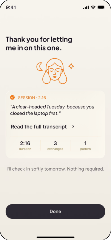
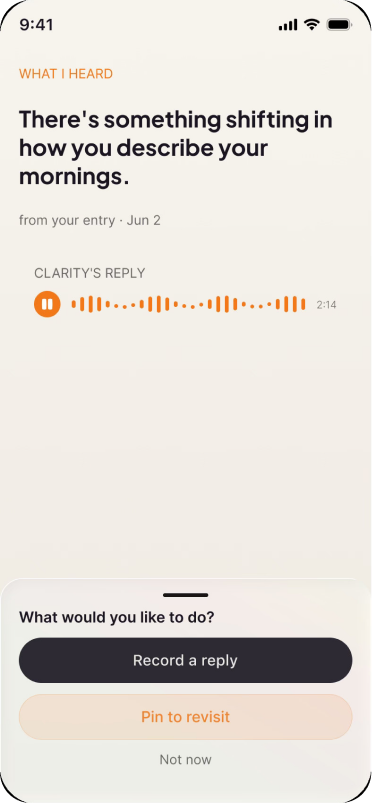
You talk the way your head actually works: messy, unfinished, out of order. Clarity’s job is to find what matters in that and hold onto it. Each session becomes a private memory, and after about two weeks it starts connecting them: “I’ve noticed something about you,” surfacing patterns you can’t see from inside your own week.
05 / HOW IT WORKS
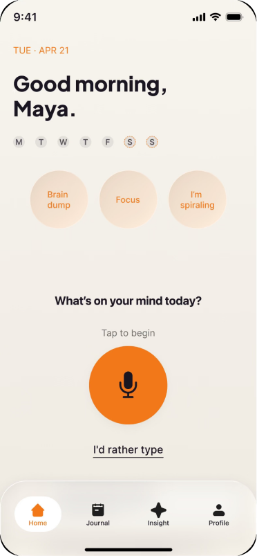
Two minutes of talking and the rest builds itself.
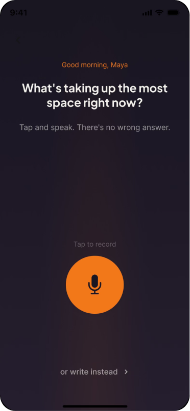
01
Speak
One tap on the mic. You talk; Clarity listens. No typing, no forms.
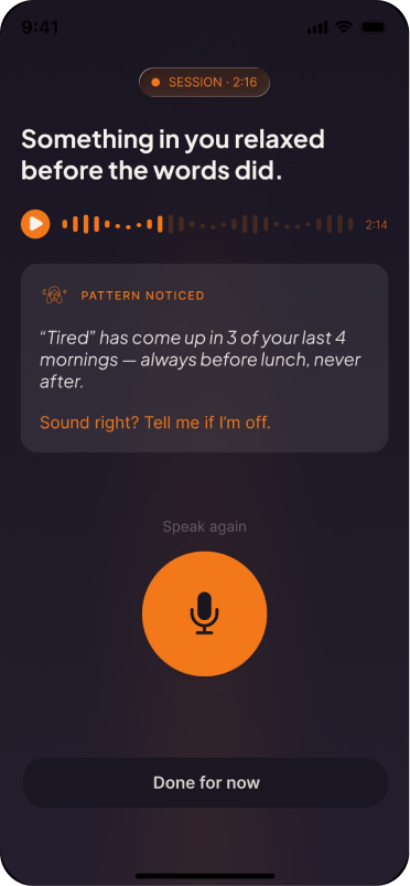
02
Clarity reflects
A short reflection in your own words, saved as a memory you can replay.
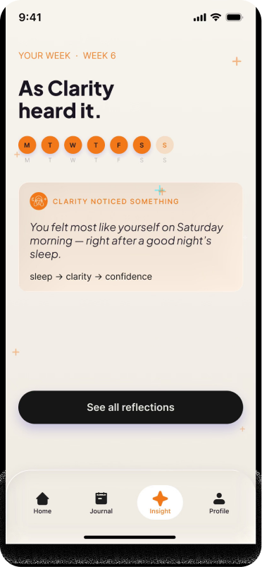
03
Patterns surface
Weeks of sessions become a Brain Map: what drains you, what helps, what keeps coming up.
06 / DESIGN LANGUAGE
One quiet system, one loud button.
Ink
#191521 · text · nav · dark bg
Paper
#F4F2ED · light bg · dark-mode text
Orange
#F37819 · THE ONE WARM ACCENT
Type
Jakarta EB · Inter · Jakarta Italic = Clarity’s voice
One accent, chosen for warmth
The system is deliberately quiet: warm ink on paper with almost no color. The one orange is deliberate, it gives a minimal, nearly colorless interface some warmth, and its loudest job is always the mic.
One primary action per screen
Filled = the one thing. Outline = secondary. Text link = tertiary. Hierarchy survives colorblindness because shape and luminance carry it.
07 / THE AUDIT
With the file feeling "done", I audited every flow from four seats: business, product design, UX writing, and developer handoff. The screens held up. The gaps between them didn't, and the biggest problems lived in what was still missing.
Every feature has a way in
A quick-action row on Home and a defined entry point for every flow, so brain dump, focus and the emergency valve are always one tap away.
Onboarding sells the real promise
Rewritten from generic wellness to “Clarity remembers what you forget,” with struggle-shaped goals that route which flow a new user meets first.
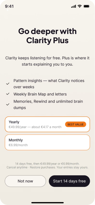
The paywall is a designed flow
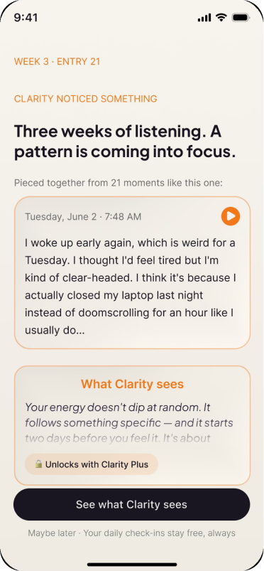
The monetization moment drawn as its own screens, teasing the insight instead of leaving the business model to be decided in code.
08 / MONETIZATION
The monetization moment is drawn as its own screens: what stays free, what the upgrade earns, and what the post-purchase and restore states look like. Designing it rather than leaving it to be decided in code is the difference between a business model and a hope.
09 / EDGE-CASE DESIGN
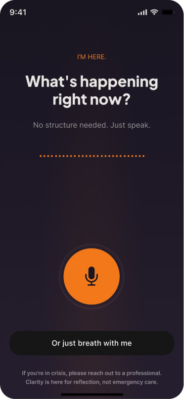
“I’m spiraling.”
A quiet emergency valve for the worst moments, one tap from Home, no output demanded.
Nothing asked back
Unlike a brain dump, spiraling mode demands no list, no summary. You empty it out; Clarity just holds it.
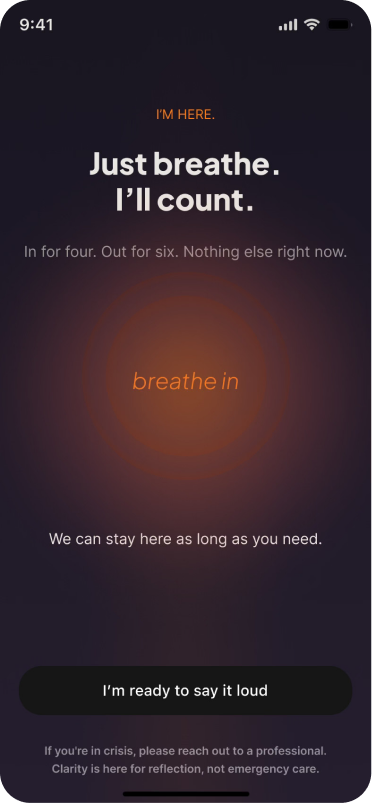
Breathe first
A “just breathe” step with a hidden mic, for when words won’t come yet. “I’m ready to say it out loud” waits below.
Reachable in the worst moment
The valve sits one tap from Home, never buried in a menu. When you’re flooded is exactly when you can’t go hunting for help.
10 / CRAFT & BUILD STATUS
Handoff-ready, down to the wiring.
Clarity is designed hand-in-hand with a developer, so the Figma file works as the actual build spec he builds from.
60+
screens
11
flows
1
design system
300+
proto wires
Wired end to end
The golden path, the day-2 loop, the emergency valve and the paywall are all clickable, so the whole thing can actually be tested.
A file a developer builds from
Components with variants, entry-point annotations inside every flow section, per-tab definitions, and one canonical close-screen pattern, all settled in the design before a line of code gets written.
Next on the board
Usability-test the golden path with five users before more polish; extend the dark session space; keep the archive page clean as the team edits live.
Contact
01 / AI VOICE JOURNALING · iOS · IN TESTFLIGHT BETA
A journaling app that remembers what you forget.
Clarity is voice-first. You talk, it listens, and over a few weeks it
shows you patterns you would never catch from inside your own week.
THE PROBLEM
People can't see their own patterns from inside their own week. Journaling apps hand them
MY ROLE
Product design end to end. I ran strategy, positioning, UX, UI, the design system, the wired prototype and monetization. Clarity is a founder-owned product and I led its design.
STATE
iOS · TestFlight beta · 60+ screens · 11 flows · 300+ prototype wires
02 / RESEARCH
Before any UI, I used AI to map the problem space: how these struggles show up, why journaling and habit apps tend to fail the people who need them most, and which pains to design for first. It pulled together what’s publicly documented about ADHD, attention, and follow-through into a ranked pain map that every screen answers to.
The blank page kills journaling
Most journaling habits die within the first week, and the blank page is where they die: no cue, no structure, no momentum. Voice input plus a single opening question removes that moment entirely.
Shame is the real churn
People rarely leave because an app is bad. They leave because missing two days feels like proof they’re broken, and streaks turn absence into guilt. Absence had to become safe.
Presence lowers the cost of starting
People start hard things more easily when something is with them: company, not instructions. That shaped the mic-first sessions, the focus mode, and the tone of every reply.
DECISION / Design for the struggle, not the label
The research drew heavily on communities where these struggles are clinical and diagnosed. The product deliberately never uses those labels. Anyone who struggles should feel welcome, never categorized, and never diagnosed by an app.
A NOTE ON RIGOR
This desk research was AI-assisted synthesis of public sources. We treat it as directional input for design decisions, not verified evidence, and this case study doesn’t cite it as such. We’re our own first users, and we test as we build.
03 / STRATEGY RESET
Halfway through, I ran the concept through a hard stress-test, arguing it from five angles: psychologist, product strategist, designer, growth, and the user I’m building for. The verdict was uncomfortable: beautiful, calm, thoughtful, and deletable within a week. Voice journaling on its own gives people nothing to come back for.
“I’d download it immediately. I’d use it for four days. Then I’d feel guilty. Then I’d delete it.”
USER SEAT · STRATEGY STRESS-TEST
01 · Memory became the product
The reframe: an AI that remembers what you forget about yourself, with voice journaling as its input. That became the positioning, an app that explains you to you.
02 · Reflection must lead somewhere
Understanding alone evaporates. Every insight now carries a next step: a pattern card, a protected morning, one focus session. The loop closes in the real day, where it actually counts.
03 · Absence became safe
No streaks anywhere in the product. Coming back after days away greets you with “you’re back,” turning the moment that kills most habit apps into a re-engagement hook.
04 / CORE DIFFERENTIATOR
Memory is the product.
You talk the way your head actually works: messy, unfinished, out of order. Clarity’s job is to find what matters in that and hold onto it. Each session becomes a private memory, and after about two weeks it starts connecting them: “I’ve noticed something about you,” surfacing patterns you can’t see from inside your own week.
05 / HOW IT WORKS
Two minutes of talking and the rest builds itself.
01
Speak
One tap on the mic. You talk; Clarity listens. No typing, no forms.
02
Clarity reflects
A short reflection in your own words, saved as a memory you can replay.
03
Patterns surface
Weeks of sessions become a Brain Map: what drains you, what helps, what keeps coming up.
06 / DESIGN LANGUAGE
One quiet system, one loud button.
Ink
#191521 · text · nav · dark bg
Paper
#F4F2ED · light bg · dark-mode text
Orange
#F37819 · THE ONE WARM ACCENT
Type
Jakarta EB · Inter · Jakarta Italic = Clarity’s voice
One accent, chosen for warmth
The system is deliberately quiet: warm ink on paper with almost no color. The one orange is deliberate, it gives a minimal, nearly colorless interface some warmth, and its loudest job is always the mic.
One primary action per screen
Filled = the one thing. Outline = secondary. Text link = tertiary. Hierarchy survives colorblindness because shape and luminance carry it.
07 / THE AUDIT
With the file feeling "done", I audited every flow from four seats: business, product design, UX writing, and developer handoff. The screens held up. The gaps between them didn't, and the biggest problems lived in what was still missing.
Every feature has a way in
A quick-action row on Home and a defined entry point for every flow, so brain dump, focus and the emergency valve are always one tap away.
Onboarding sells the real promise
Rewritten from generic wellness to “Clarity remembers what you forget,” with struggle-shaped goals that route which flow a new user meets first.
The paywall is a designed flow
The monetization moment drawn as its own screens, teasing the insight instead of leaving the business model to be decided in code.
08 / MONETIZATION
The monetization moment is drawn as its own screens: what stays free, what the upgrade earns, and what the post-purchase and restore states look like. Designing it rather than leaving it to be decided in code is the difference between a business model and a hope.
09 / EDGE-CASE DESIGN
“I’m spiraling.”
A quiet emergency valve for the worst moments, one tap from Home, no output demanded.
Nothing asked back
Unlike a brain dump, spiraling mode demands no list, no summary. You empty it out; Clarity just holds it.
Breathe first
A “just breathe” step with a hidden mic, for when words won’t come yet. “I’m ready to say it out loud” waits below.
Reachable in the worst moment
The valve sits one tap from Home, never buried in a menu. When you’re flooded is exactly when you can’t go hunting for help.
10 / CRAFT & BUILD STATUS
Handoff-ready, down to the wiring.
Clarity is designed hand-in-hand with a developer, so the Figma file works as the actual build spec he builds from.
60+
screens
11
flows
1
design system
300+
proto wires
Wired end to end
The golden path, the day-2 loop, the emergency valve and the paywall are all clickable, so the whole thing can actually be tested.
A file a developer builds from
Components with variants, entry-point annotations inside every flow section, per-tab definitions, and one canonical close-screen pattern, all settled in the design before a line of code gets written.
Next on the board
Usability-test the golden path with five users before more polish; extend the dark session space; keep the archive page clean as the team edits live.
← Back to all work
Next · LungsRot →
Contact
Contact
01 / AI VOICE JOURNALING · iOS · IN TESTFLIGHT BETA
A journaling app that remembers what you forget.
Clarity is voice-first. You talk, it listens, and over a few weeks it
shows you patterns you would never catch from inside your own week.
THE PROBLEM
People can't see their own patterns from inside their own week. Journaling apps hand them a blank page and a streak to keep.
MY ROLE
Product design end to end. I ran strategy, positioning, UX, UI, the design system, the wired prototype and monetization. Clarity is a founder-owned product and I led its design.
STATE
iOS · TestFlight beta · 60+ screens · 11 flows · 300+ prototype wires
02 / RESEARCH
Before any UI, I used AI to map the problem space: how these struggles show up, why journaling and habit apps tend to fail the people who need them most, and which pains to design for first. It pulled together what’s publicly documented about ADHD, attention, and follow-through into a ranked pain map that every screen answers to.
The blank page kills journaling
Most journaling habits die within the first week, and the blank page is where they die: no cue, no structure, no momentum. Voice input plus a single opening question removes that moment entirely.
Shame is the real churn
People rarely leave because an app is bad. They leave because missing two days feels like proof they’re broken, and streaks turn absence into guilt. Absence had to become safe.
Presence lowers the cost of starting
People start hard things more easily when something is with them: company, not instructions. That shaped the mic-first sessions, the focus mode, and the tone of every reply.
DECISION / Design for the struggle, not the label
The research drew heavily on communities where these struggles are clinical and diagnosed. The product deliberately never uses those labels. Anyone who struggles should feel welcome, never categorized, and never diagnosed by an app.
A NOTE ON RIGOR
This desk research was AI-assisted synthesis of public sources. We treat it as directional input for design decisions, not verified evidence, and this case study doesn’t cite it as such. We’re our own first users, and we test as we build.
03 / STRATEGY RESET
Halfway through, I ran the concept through a hard stress-test, arguing it from five angles: psychologist, product strategist, designer, growth, and the user I’m building for. The verdict was uncomfortable: beautiful, calm, thoughtful, and deletable within a week. Voice journaling on its own gives people nothing to come back for.
“I’d download it immediately. I’d use it for four days. Then I’d feel guilty. Then I’d delete it.”
USER SEAT · STRATEGY STRESS-TEST
01 · Memory became the product
The reframe: an AI that remembers what you forget about yourself, with voice journaling as its input. That became the positioning, an app that explains you to you.
02 · Reflection must lead somewhere
Understanding alone evaporates. Every insight now carries a next step: a pattern card, a protected morning, one focus session. The loop closes in the real day, where it actually counts.
03 · Absence became safe
No streaks anywhere in the product. Coming back after days away greets you with “you’re back,” turning the moment that kills most habit apps into a re-engagement hook.
04 / CORE DIFFERENTIATOR
Memory is the product.
You talk the way your head actually works: messy, unfinished, out of order. Clarity’s job is to find what matters in that and hold onto it. Each session becomes a private memory, and after about two weeks it starts connecting them: “I’ve noticed something about you,” surfacing patterns you can’t see from inside your own week.
05 / HOW IT WORKS
Two minutes of talking and the rest builds itself.
01
Speak
One tap on the mic. You talk; Clarity listens. No typing, no forms.
02
Clarity reflects
A short reflection in your own words, saved as a memory you can replay.
03
Patterns surface
Weeks of sessions become a Brain Map: what drains you, what helps, what keeps coming up.
SIX SURFACES · DAILY CHECK-INS · BRAIN DUMP · FOCUS · PATTERN→ACTION · WEEKLY BRAIN MAP · SPIRALING VALVE
06 / DESIGN LANGUAGE
One quiet system, one loud button.
Ink
#191521 · text · nav · dark bg
Paper
#F4F2ED · light bg · dark-mode text
Orange
#F37819 · THE ONE WARM ACCENT
Type
Jakarta EB · Inter · Jakarta Italic = Clarity’s voice
One accent, chosen for warmth
The system is deliberately quiet: warm ink on paper with almost no color. The one orange is deliberate, it gives a minimal, nearly colorless interface some warmth, and its loudest job is always the mic.
One primary action per screen
Filled = the one thing. Outline = secondary. Text link = tertiary. Hierarchy survives colorblindness because shape and luminance carry it.
07 / THE AUDIT
With the file feeling "done", I audited every flow from four seats: business, product design, UX writing, and developer handoff. The screens held up. The gaps between them didn't, and the biggest problems lived in what was still missing.
Every feature has a way in
A quick-action row on Home and a defined entry point for every flow, so brain dump, focus and the emergency valve are always one tap away.
Onboarding sells the real promise
Rewritten from generic wellness to “Clarity remembers what you forget,” with struggle-shaped goals that route which flow a new user meets first.
The paywall is a designed flow
The monetization moment drawn as its own screens, teasing the insight instead of leaving the business model to be decided in code.
08 / MONETIZATION
The monetization moment is drawn as its own screens: what stays free, what the upgrade earns, and what the post-purchase and restore states look like. Designing it rather than leaving it to be decided in code is the difference between a business model and a hope.
09 / EDGE-CASE DESIGN
“I’m spiraling.”
A quiet emergency valve for the worst moments, one tap from Home, no output demanded.
Nothing asked back
Unlike a brain dump, spiraling mode demands no list, no summary. You empty it out; Clarity just holds it.
Breathe first
A “just breathe” step with a hidden mic, for when words won’t come yet. “I’m ready to say it out loud” waits below.
Reachable in the worst moment
The valve sits one tap from Home, never buried in a menu. When you’re flooded is exactly when you can’t go hunting for help.
10 / CRAFT & BUILD STATUS
Handoff-ready, down to the wiring.
Clarity is designed hand-in-hand with a developer, so the Figma file works as the actual build spec he builds from.
60+
screens
11
flows
1
design system
300+
proto wires
Wired end to end
The golden path, the day-2 loop, the emergency valve and the paywall are all clickable, so the whole thing can actually be tested.
A file a developer builds from
Components with variants, entry-point annotations inside every flow section, per-tab definitions, and one canonical close-screen pattern, all settled in the design before a line of code gets written.
Next on the board
Usability-test the golden path with five users before more polish; extend the dark session space; keep the archive page clean as the team edits live.
← Back to all work
Next · LungsRot →
Contact